
Your website is often the first place customers meet your business, and first impressions happen fast. If your design feels cluttered, outdated, or hard to use, visitors may leave within seconds. This means lost opportunities and lower trust. A clear and engaging design can be the difference between a visitor leaving or turning into a loyal customer.
To really solve this problem we have 10 Principles of Good Website Design, that improve usability, strengthen trust, and guide visitors toward action. From navigation to typography, every element shapes the user experience. By applying these principles, you can build a website that is not only attractive but also highly effective. Keep reading to learn how you can make your site work better for your business.
Why Good Website Design Matters
Your website is like a digital storefront, and visitors often judge your business within seconds. A professional and easy-to-use design builds trust, while an outdated or cluttered layout can push people away. Clear navigation, readable content, and fast performance encourage users to stay longer, browse your pages, and feel more confident about engaging with your brand.
Good website design also influences online visibility and growth. Search engines like Google favor sites that are mobile-friendly, quick to load, and easy to navigate. This means a strong design directly improves your rankings and attracts more visitors. Beyond appearance, design affects how easily users find what they need, which in turn increases leads, sales, and overall business success.
Another key reason design matters is competition. With so many alternatives online, users will not wait if your site looks confusing or outdated. They can quickly move to a competitor that offers a smoother experience. A modern, well-structured website helps you stand out, keeps visitors coming back, and positions your brand as reliable and professional in your industry.
Principle 1: Clear Purpose
A website without a clear purpose can confuse visitors and drive them away. Every site must communicate its main goal within seconds, whether that is providing information, generating leads, or selling products. The design, layout, and content should all guide users toward this purpose. When visitors instantly understand what your website offers, they feel more confident and are more likely to continue exploring.
Different types of websites require different approaches to purpose. An e-commerce site should highlight products, prices, and purchasing options, while a service-based business should focus on expertise, testimonials, and calls-to-action such as “Book Now” or “Request a Quote.” A clear purpose ensures every page communicates one message and encourages one action, making navigation simple and improving the chances of conversion.
Principle 2: Simplicity and Minimalism
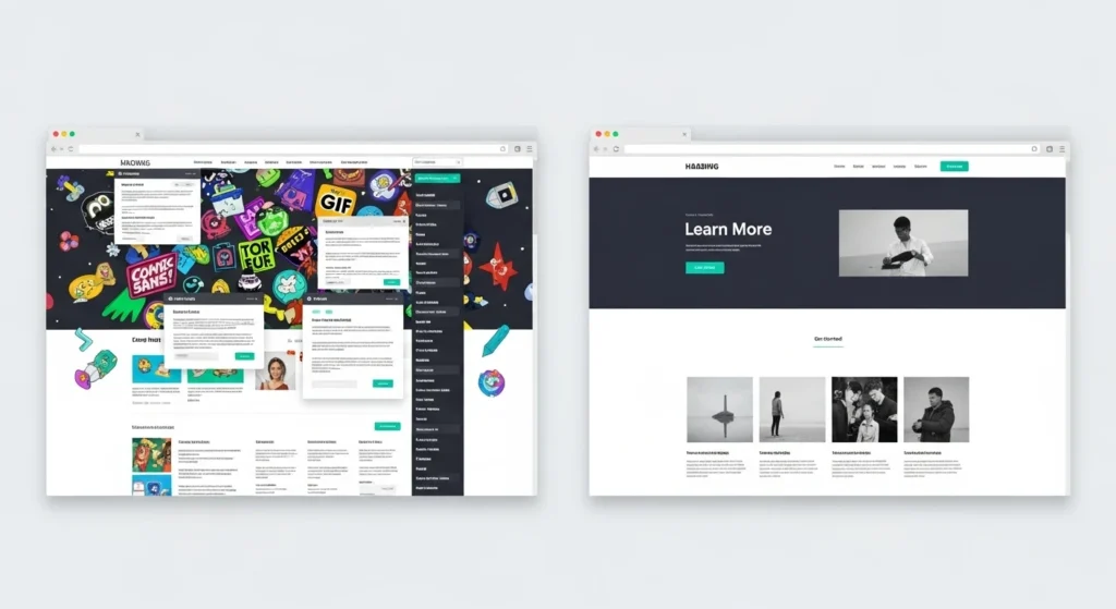
Simplicity is one of the most important aspects of good website design. A cluttered layout with too many images, colors, or text blocks can overwhelm users and make navigation difficult. Minimalist design keeps the focus on what truly matters by using clean layouts, limited color schemes, and plenty of whitespace. This not only improves readability but also helps visitors process information quickly without distractions.
A simple design also makes calls-to-action more effective. When unnecessary elements are removed, buttons like “Buy Now” or “Contact Us” stand out clearly. Brands such as Apple use minimalism to create elegant websites that feel modern and easy to use. By focusing on essential content and avoiding visual noise, businesses can improve usability, strengthen brand identity, and create a smoother experience for their visitors.
Principle 3: Intuitive Navigation
Navigation acts like a roadmap for your website. If users cannot find what they need quickly, they will leave and look elsewhere. Menus, buttons, and internal links should be easy to spot and clearly labeled. Organizing your site in a logical structure helps users move smoothly from one section to another. Simple navigation reduces frustration and keeps visitors engaged longer.
Best practices for navigation include keeping menus short, following a clear hierarchy, and ensuring key pages are always accessible. Many designers follow the three-click rule, meaning users should be able to reach any page in three clicks or fewer. Features like sticky navigation bars and breadcrumbs also improve usability, making it easier for visitors to know where they are and how to move around your site.
Principle 4: Visual Hierarchy
Visual hierarchy guides users’ eyes to the most important elements on a webpage. Designers achieve this by using size, color, contrast, and placement to show what matters most. For example, a large headline at the top grabs attention first, while a smaller subheading provides supporting details. This technique ensures users do not miss essential information and helps them absorb content in the order you want.
Reading patterns also play a role in hierarchy. Many users scan pages in an F-shape or Z-shape, starting at the top and moving across before scanning down. Placing key messages, images, and buttons in these natural eye paths makes your content more effective. A strong visual hierarchy keeps the design organized, prevents confusion, and encourages users to focus on calls-to-action that drive conversions.
Principle 5: Consistency and Branding
Consistency makes a website feel professional and reliable. When fonts, colors, and layouts change too often, users may feel confused or disconnected. A consistent design ensures visitors know what to expect as they move from one page to another. This smooth experience reduces friction and helps users focus on your content rather than being distracted by design changes.
Branding is an important part of consistency. Using your brand’s colors, logos, and tone of voice across the site strengthens recognition and builds trust. For example, a business that uses the same design style in its website, social media, and marketing materials will be more memorable. When users can easily connect the design to your brand identity, they are more likely to return and become loyal customers.
Principle 6: Responsive and Mobile First
Today, most users access websites through smartphones and tablets, which makes mobile-friendly design essential. A responsive website automatically adjusts to different screen sizes, ensuring that text, images, and buttons display properly. Without responsiveness, users may face zooming, scrolling, or broken layouts that frustrate them and cause them to leave. A smooth mobile experience keeps visitors engaged and encourages them to return.
Adopting a mobile-first approach means designing for small screens first, then scaling up for larger ones. This ensures key features like navigation menus, calls-to-action, and content are optimized for mobile users. Google also rewards mobile-friendly websites with better search rankings, making this not just a design choice but also an SEO advantage. Prioritizing mobile design improves usability, boosts traffic, and helps your website stay competitive.
Principle 7: Fast Loading and Performance
Website speed is a critical part of user experience. Research shows that even a one-second delay can cause higher bounce rates and fewer conversions. Visitors expect fast and smooth browsing, and if pages take too long to load, they are likely to leave and never return. A quick, responsive site keeps people engaged, builds trust, and increases the chances of turning visitors into customers.
There are many ways to improve website performance. Compressing images, reducing large files, and removing unnecessary scripts help pages load faster. Enabling caching and using lazy loading for images also make the site more efficient. Tools like Google PageSpeed Insights and GTmetrix can identify issues and suggest fixes. A fast website does not just improve user satisfaction, it also boosts search engine rankings and visibility.
Principle 8: Readable Content and Typography
Readable content is the foundation of effective website communication. If users struggle to read text, they will not stay long on your site. Choosing simple, web-safe fonts and appropriate font sizes makes a big difference. Proper contrast between text and background also improves legibility, especially on mobile screens. A clear structure with short sentences and well-spaced lines keeps readers comfortable and focused on your message.
Good typography also improves how users interact with information. Limiting line length to 50–75 characters makes reading easier, while headings, bullet points, and visuals help break content into scannable sections. Visitors rarely read every word on a page, so making text easy to skim keeps them engaged. By combining readability and structure, your website becomes more user-friendly, encouraging people to stay longer and take action.
Principle 9: Accessibility and Inclusivity
Accessibility ensures that your website can be used by everyone, including people with disabilities. Adding descriptive alt text to images allows screen readers to explain visuals to visually impaired users. Using strong color contrast helps those with low vision, while providing captions on videos supports users with hearing difficulties. These small but important steps make your website welcoming and usable for a much wider audience.
Inclusivity in design is not just about meeting accessibility standards, it is about creating equal experiences for all users. Features like keyboard navigation, clear labels, and simple language make websites easier for everyone, not only those with disabilities. Following guidelines such as WCAG improves usability and also boosts SEO performance. An accessible and inclusive website shows that your brand values diversity, making visitors feel respected and valued.
Principle 10: Feedback Testing and Iteration
A successful website is not a one-time project but an ongoing process. User behavior changes over time, and design trends evolve, so your website must adapt. Collecting feedback through surveys, chatbots, or contact forms helps you understand what visitors like or dislike. Monitoring analytics reveals how users move through your site, which pages they spend time on, and where they drop off. This data is essential for improvement.
Testing and iteration turn insights into action. A/B testing different layouts, colors, or calls-to-action shows which version performs better. Regular updates also keep your site fresh and relevant to user expectations. Iteration ensures your website is not only functional but also aligned with the latest design practices. By continuously testing and refining, you build a website that evolves with your audience and delivers lasting results.
How to Implement These Principles on Your Site ?
Audit Your Current Website
The first step is to review your existing site. Check if each page has a clear purpose, simple design, and easy navigation. Test the site on different devices to ensure it looks good everywhere and loads quickly. Identify pages where users might face difficulties, such as confusing layouts or broken links. A detailed audit gives you a clear idea of what to fix first.
Prioritize Key Improvements
Not all changes need to be done at once. Start with improvements that have the biggest impact on user experience, such as mobile responsiveness, page speed, and navigation. Fixing these areas makes your website instantly more usable and enjoyable for visitors. Gradually, you can work on secondary areas like typography, accessibility, and branding to create a complete and polished design.
Use Tools for Guidance
There are several tools to help identify issues and track progress. Google PageSpeed Insights measures performance and suggests ways to improve loading times. Hotjar provides session recordings and heatmaps that show how users interact with your site. Usability testing platforms allow you to gather real feedback from real users. These tools give you data-driven insights, making it easier to refine your design effectively.
Continuous Testing and Refinement
Website design is not a one-time project. Once you make improvements, monitor analytics and collect user feedback to see what is working. A/B testing different layouts, calls-to-action, or colors helps you understand which version delivers better results. By consistently testing and refining, your website stays updated, relevant, and aligned with user expectations.
Common Mistakes to Avoid
Cluttered Layouts and Popups
Too many visual elements, animations, or popups make a site look messy and hard to use. Clutter distracts visitors from important content and slows down loading speed. Keeping layouts clean and focused ensures that users can quickly find the information they need without frustration.
Ignoring Mobile Users
Designing only for desktop users is a major mistake. With most web traffic coming from mobile devices, a site that is not mobile-friendly will lose a large part of its audience. Responsive design ensures your website works smoothly on all screen sizes, creating a consistent experience for every visitor.
Poor Accessibility
Accessibility issues such as missing alt text, weak color contrast, or layouts that cannot be navigated by keyboard make a site unusable for people with disabilities. This not only excludes part of your audience but also damages your brand image. Following accessibility best practices ensures your website is inclusive and user-friendly for everyone.
Inconsistent Branding
A website that uses different fonts, colors, or design styles across pages looks unprofessional and confuses visitors. Inconsistent branding reduces trust and makes it harder for people to recognize your business. Keeping a consistent brand identity across your site improves recognition and builds stronger relationships with users.
Conclusion
Good website design is more than making a site look attractive. It is about creating a smooth, user-focused experience that builds trust, improves usability, and drives results. By applying the ten principles discussed, from clear purpose and simplicity to mobile responsiveness and accessibility, you can transform your website into a powerful digital tool that supports your business goals.
The key is to see design as an ongoing process. Regular feedback, testing, and updates ensure your site stays modern and aligned with user expectations. Avoiding common mistakes and focusing on proven principles will keep your visitors engaged and loyal. If you want professional guidance in building or redesigning a website that delivers results, the team at GrowthStorm is ready to help you take the next step.


